TeamPhotoshop
Reviews, updates and in depth guides to your favourite mobile games - AppGamer.com
Tutorials

Photoshop Christmas Tree

Oct 18th 2005
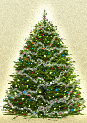
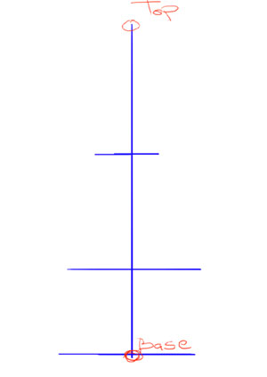
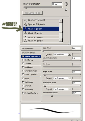
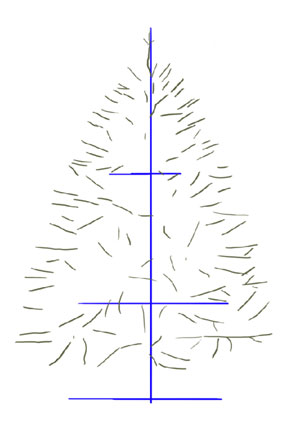
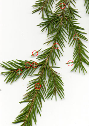
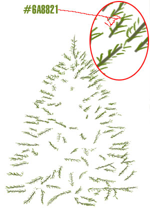
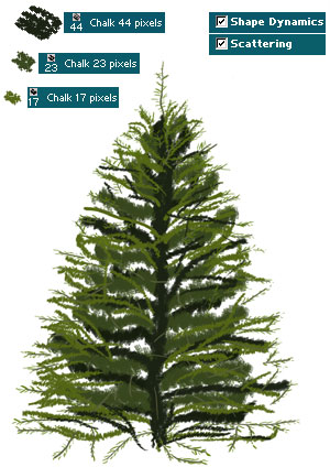
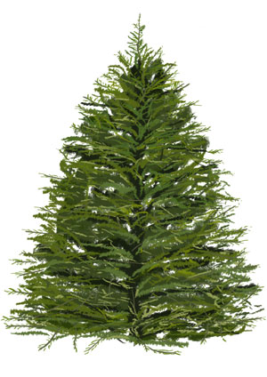
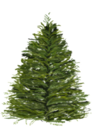
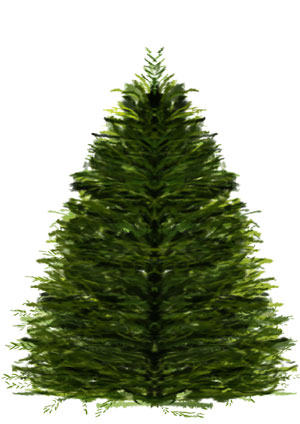
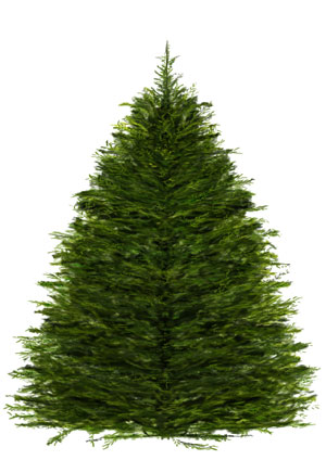
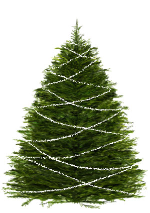
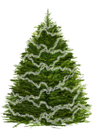
Draw a Christmas tree - lights and stuff:
1.
This tutorial was written by Mihai
www.roundpixel.org

This should give you something like my pic. It's very simple and the results are good looking.All it takes is a little patience, a Wacom if you're not good with a mouse and a modicum of drawing skills. - No Van Gogh stuff here:)

 2.
Make a new document as big as you dare:) If it goes well you may want to print it...if not...oh well. We're going to have some sort of skeleton for our tree - I just drew some guidelines to help me see where my tree starts and how "fat" it's going to be.

 3.
Now lets see what kind of brushes we'll be using. The "chalk" ones seem to give a nice texture...The settings I'm using for this stage are pretty obvious. I'm using an olive green color. What you need to remember is that as soon as you change color - you need to make a new layer. My blue guidelines for instance are on their own layer... Each color you're going to use will have its own layer...for now at least.

 4.
I used the brush to draw the general outlines of my tree - this is the stage where you decide the final shape of the tree... I didn't use fancy textures - just honest strokes... It looks like a porcupine but the shape it's there ...
 5.
I scanned a real branch - it's always nice to have a pic with real colors of the stuff you mean to draw... The "target" thinghies are spots likely to be picked for colors to use in my drawing. All throughout the process I picked colors from this "real" pic.
 6.
Ok - now comes the "work" part - so far we've been only playing with settings and such... I made some needles for my branches. Remember to make these on a new layer - we changed color....
 7.
Below the branches and needles layers I started drawing with larger brushes..and slightly more complex settings. I am still sticking to the chalk brushes but I scattered them on both axes conditioned by the pen pressure to start adding a little texture to my tree. I made a "spine" and some very heavy branches.
Remember to put every color on its own layer... I only used three colors - the ones in the pic.
 8.
Hey - this looks more and more like a real tree:). I merged four of my layers - the thick, scattered strokes and the branches. The needles are still on their own layer. Then I started picking colors from my drawing, used a No.11 chalk brush, scattered on both axes and I just scribbled a lot, picking colors from time to time. Mainly there are still three colors. But some other shades were added when I used the picker because of the feathering and the fact that some of the layers are now merged.
 9.
Ok - this definitely looks too blurry and smudged...That's because it's what I did. I blurred the thing a bit and then used a 14 Spatter brush to smudge the strokes. This was done to bring out some more shades of green and to fill a bit the empty spots...
The needles layer is still on its own...not blurred - not smudged.
 10.
I duplicated the blurred/smudged layer and flipped it horizontally. The layer on top has the blending mode set to "Multiply". Our little tannenbaum is richer - more branches and less holes - but it looks like a mirror reflection. There's no randomness....and it looks kind of bad.
 11.
This is what my tree looks like after a lot of brushing to remove that "mirrored" appearance. I'd say we could fool people and say it's a real picture:) When it's resized this small it really looks like a picture. I you look closer though - you will still see the strokes. Take a look at a very large pic of this stage.It came out nicely - no more repetitive parts. This is where I merged the "needles" layer with the others. Then I added a lot of strokes with colors that I picked from my former layers. Still - it's not difficult - just scribble a lot.The fact that the brushes (I'm still sticking to "chalk") are scattered helps a lot with the texture.
 12.
Ok - time to give little Tannenbaum a few ornaments - he's nice but we're going for "pimpy." I don't know how that stuff is called - the rope like fuzzy things. I drew those with a soft round brush and then I changed the layer blending mode (yes it's on its own layer) to "Dissolve" Then made another, empty layer on top of that and merged the two to retain the dissolved look and still have "Normal" as blending mode. You'll see why next.
 13.
Hah - much nicer:) And easy - I went to - Distort - Wave - default settings - then added an "outer glow" effect to the layer - still default settings - only I changed the color of the glow from light yellow to white.
 14.
The End:).
There - all done. The lights are extremely easy - just a soft round brush. There are actually three layers of lights - yes - a layer for every color. They all have outer glow but the settings are different. The outer glow of the white lights layer is set to "Vivid light," for the blue layer I used "hard light" and for the red layer - "Color burn." The background is just a gradient and I added some noise - Gaussian, monochromatic. I also dodged it around the tree with the Dodge tool set to Highlights range - I used a round feathered brush - a big one.

I know it's cheesy - but hey - it's Christmas:)
Have fun!