Tutorials
Layer Blend Modes Explained!
Oct 18th 2005
|
Layer Blend Modes Explained:
|
 |
1.
What Are Blend Modes?
Up at the top of the Layers Palette hovers a mysterious pop-up menu that few novice Photoshop users tamper with. It has a lot of mysterious sounding choices like Multiply and Screen. This unlabeled menu is home to your Layer Blending Mode Options. And you really do need to start messing around with them. There are so many possible outcomes to your images when you use Photoshop, and when you have an understanding of what Blend modes do, you'll have a lot more creative ammo at your disposal.
Note: the Blending Modes we'll discuss here are also available while using your Painting and Editing Tools. Just check out your Options Bar (V. 6.0 & later.) |
|
 |
2.
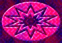
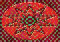
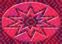
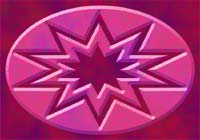
The Cast of Characters
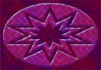
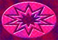
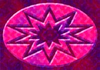
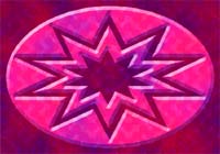
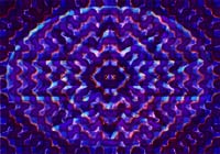
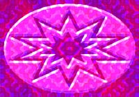
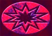
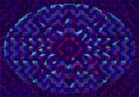
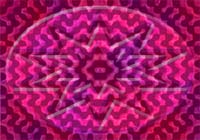
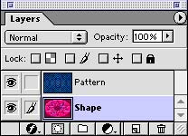
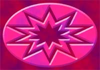
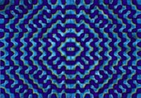
To avail yourself of Blend Modes, you need an image with a couple of layers. To the left, you see the images I'm going to use here. The bottom (or Base) layer is going to be the SHAPE, which I created using the vector-based shape tools. This one will stay in Normal mode at 100% opacity (exactly as you see it.) The other (the Blend layer) is the PATTERN, which is based on one of my Team Action Textures which are available for free download here. This layer is placed above the shape and it will be the one we'll experiment blending. I'll also show you what it looks like at half-opacity.
A Blend Mode specifies how the pixels in one layer interact with another. And each Blending Option makes the Pixels interact differently. When we're done here, you'll understand better how each one works.
Of course, seeing how my two images interact will just give you an idea of what is possible. Each image will be different. There are 4 factors which affect the outcome:
-Image One (Base Colors)
-Image Two (Blend Colors)
-The Blend Mode
-The Opacity
These 4 variables combine to make the colors we'll see in our Result Image. |
|
|
|


|
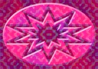
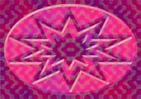
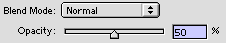
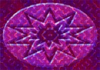
3.
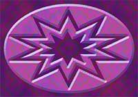
What is Normal Anyway?
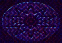
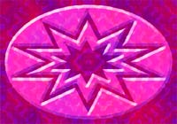
Well, of course, with the pattern at normal mode, 100% opacity, we wouldn't see the shape image at all. For any "blending" of the two images to occur in normal mode, you'll have to lower the opacity of the upper one. Which is what I've done. The pattern is set to 50% opacity; meaning it is now 50% transparent, which allows the shape to show through a bit. So what's happening is simple: the blues in our blend image are added to the reds in our base image, giving us an overall appearance featuring many violets.
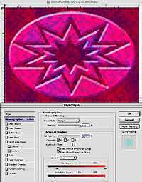
In addition to the top of the Layers Palette, you can adjust opacity and select a Blend Mode by accessing the Layer Style Dialog Box. Choose Layer: Layer Style: Blending Options or just double click on any layer in the palette (other than the background.) When you see the Blending Options, you'll notice some advanced blending controls. We'll touch on these later.
|
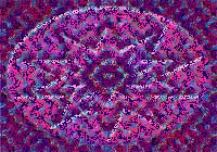 |
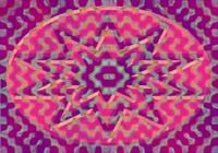
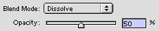
4.
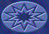
Dissolve
Dissolve relies on a less-than-100% opacity setting as well so the blend layer (pattern) is shown here again at 50%. (At full strength, we'd just see the pattern.) If you set your Blend Mode to Dissolve, You can watch pixels randomly disappear as you slide the opacity down from 100. If you compare The result image (bottom left) with that in step 3 above, you'll see the color blending is the same; the difference here is that half of the pixels in my blend image have been arbitrarily eliminated. |
Base Color  
Blend Color  
Result Color   |
~Interlude~ Some Math
Math? Nobody said there was going to be math! Well, there is. Many of the blend modes we'll examine are going to do computations with the numerical values of the colors of the pixels in your images. Multiply and Screen, which we'll see next, are two of them.
Here's how it works: A color in an RGB image is made of three color channels, each of which has a numerical value. RGB is an additive color mixing system (each channel at full strength combines to make white), so the color Black would have a value of Zero (0%) in all three channels, while pure White has a value of 255 (100%) in each channel. Pay attention to the fact that 255 = 100%, because the calculations that will be done will use the percentage (out of 255) of the numerical value of the channel. Let's see one example in action: |
|
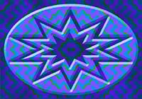
5.
Multiply
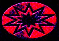
Okay, this aptly named blend mode multiplies the base color by the blend color to give us the result color. It always results in darker hues. Let's see why.
Look again at the images in the step above. I placed a color sampler down and took readings of each of the three colors used in the Multiply blend mode. You can see the numerical values from my Info Palette. The calculations for each of the RGB channels will be performed the same, so let's just look at one, the Red Channel. In the Base Image, that's a pretty light version of red, so you shouldn't be surprised to see a high numerical value. It is 250. (Remember, 255 is white.) This is going to be multiplied by the red channel in our blend image, which you see has a value of 46. But those of you who think the answer should be 11,500 are failing to realize that our Blend Color (46) is going to be translated to its percentage value, which is 0.18 (46 is 18% of 255.) So the Result Color has a red channel value of 45, since 250 x 0.18 = 45. So you see, unless you're blending a layer of complete white, the resulting colors can't help but have a lower value (closer to Black) than the base colors, since you're always multiplying by something less than 100%.
(If you want to understand the math better, try working out the blue channel and see how we got a result color value of 83.)
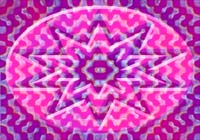
You can see my Multiply-ed result image at middle left, full of dark indigo and violet. At bottom left, I've lowered the opacity on my blend image to 50% so you can see another possible outcome.
|
|
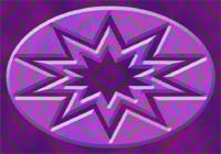
6.
Screen
Once you understand how Multiply works, you might look at my Screen example and say that it looks like sort of the opposite effect. And you'd be right. Screen performs the exact same multiplication steps as Multiply, except that every numerical value is replaced with its inverse, or opposite, including the answer. (This one was really mind-boggling to figure out, so if there's a simpler way to calculate this, somebody let me know.)
Remember in Multiply above, the red channel values of 250 x 0.18 (46) = 45. Well here's how it works for Screen: The numerical values of our Base & Blend colors are inverse-d (250 becomes 5 and 46 becomes 209- add them up, they total 255- our magic number) So, we multiply 5 by 209 (0.82) and get 4 as our answer. Now take the inverse of 4 and you get 251. And that 251 color is actually what gets displayed.
Damn, that's confusing, but that's how it works. Try it yourself: Here's my Screen-ed numerical values for that Color sampler point I showed you in the interlude above: R=251; G=37; B=209
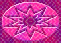
However you feel about understanding how Screen works, you can always count on this: the result color will always be a lighter color. At left you can see my original images; and blends at 100% and 50%. |
|
7.
Overlay
Overlay looks like it falls somewhere in the middle of the results we got for Multiply and Screen above. It does, sort of. It actually combines both of those blending effects but lets the base image stand out a lot more than either. This is because it uses the Multiply mode on the shadows; and uses Screen on the highlights. |
|
8.
Soft Light
This one treats the blend image as if it were the light source (a Soft Light) for the base image. So if the blend color is brighter than 50% (has a numerical value greater than 127.5, which is half of 255), then the base color gets lightened subtly. If the blend image's color is darker than 50% (has a numerical value less than 127.5) then the base image's color gets darkened a little.
Compare the 100% opacity example at left to the 50% opacity example up there in Overlay. They look pretty similar, and that's a good way to think about Soft Light- as a subtle Overlay.
Check out the blend layer at 50% opacity here at bottom left. The result effect is not much different than the original base image. |
|
9.
Hard Light
If Soft Light was subtle, Hard Light should be not-so-subtle, right? Right.
Hard Light looks at the relative brightness of the blend color exactly as I described in Soft Light above.
Unlike Soft Light, however, it Screens those color values lighter than 50%; and Multiplies those colors with a value lower than 50%.
Sounds a little like what Overlay supposedly did above, right? The difference is Hard Light doesn't pay as much attention (in fact, none) to the highlights & shadows of our base image.
The result effect is supposed to be like what would happen if our blend image (the pattern) were a harsh spotlight, and it was cast directly on our base image (the shape). |
|
10.
Color Dodge
Color Dodge probably has the most in common with Screen, in that the result effect is going to be always lighter than the base image. But unlike Screen, Color Dodge pays a lot more attention to the base image. It lightens the base image, depending on how light the blend image is. The only place where no lightening would occur would be where black was present in the blend image. |
|
11.
Color Burn
Like the Dodge & Burn Tools, Color Dodge and Color Burn are sort of opposite blend modes. Color Burn will darken the base image, depending on how dark the blend image is. The only place where no darkening would occur would be where white was present in the blend image (nowhere, in this case). |
|
|
12.
Darken
Darken is a simple one to understand. It just compares the individual pixels in both the base and blend images and uses whichever was darker for the pixel seen in the result image. See- no math. Just pick the darker of two colors and use it.
Actually, there was math involved, it's just not that important to understand. But for those who care, the result RGB numerical values for the color sampler I had set down in the interlude above where this:
That's right- it's the same as the values in the blend image. That's because for this particular location, all three color channels where darker (closer to zero) than in the base image. |
|
13.
Lighten
The name says it all doesn't it? You know already that it's going to do the opposite of darken above: compare the pixels in the base and blend image and use whichever ones are lighter in the resulting image. It's that simple. As a matter of fact, I've got so much faith in you, I'll bet you can deduce what the result image RGB values are for that color point I've been referring to. |
|
14.
Difference
This mode again relies on math. But it's simple to understand. Difference examines the numerical values for color in both the base and blend images, and subtracts the lower number (darker color) from the higher number (brighter color). The result color has a numerical value which is the difference between the two values. In other words, the red channel in my color sampler had a base value of 250; and a blend value of 46; so the red channel's value here is 204 (250 - 46 = 204) Simple! |
|
15.
Exclusion
Exclusion is like a watered-down Difference. If a dark pixel interacts with a light one, the effect is much the same. But Exclusion treats the middle values differently than Difference. A mid-range value blending with a mid-range value in Difference would produce a very dark value. In Exclusion, the result color for middle range values stays in the middle range. The effect is like a much softer, lower contrast version of Difference. |
|
16.
Hue
Those of you familiar with the HSB (Hue; Saturation; Brightness) values of colors will understand these next few easily. The remaining four blend modes play around with mixing up the HSB properties of the base and blend colors.
If you ever want to check out those values, just click on your foreground color to bring up the Color Picker. On the left side you'll see the RGB, Lab, CMYK, and HSB values for whatever color you use the eyedropper to click on.
The Hue blend mode does this:
It uses the Hues (the colors) of the blend image (my pattern); but the Saturation (intensity) and Brightness (luminance) from the base image (my shape). |
|
17.
Saturation
I'll bet you can guess what this one will do.
Saturation uses the Saturation (intensity) of the colors in the blend image (my pattern); but the Hues (the colors) and Brightness (luminance) from the colors in the base image (my shape). |
|
18.
Color
This one uses the Hues (the colors) and Saturation (intensity) of the colors in the blend image (my pattern); but the Brightness (luminance) from the colors in the base image (my shape).
If you want to tint, or colorize an image easily, create a layer above it and fill that layer with the color(s) you want to tint it with. Then try either the Color or Hue blending modes. |
|
19.
Luminosity
This mode uses yet another combination and you can already see the results are sort of the opposite of the Color and Hue blend modes. It is a colorization of our blend image (my pattern) using the colors of the base image (my shape).
That's because it uses the Hues (the colors) and Saturation (intensity) of the colors in the base image; but the Brightness (luminance) from the colors in the blend image. |
 |
20.
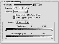
Advanced Blending
To further complicate things, Photoshop gives us advanced options that allow you to customize your blend effect or restrict blending to selected portions of your images.
You can do things like restrict the blending to a certain range of colors or values; and turn of blending in one or more of you color channels. But because you know so much already, and frankly I'm beat from all that math, I think we'll stop where we are. Have fun experimenting and learning.
 |
|
|
Latest Forums Clone YourselfThat is quit nice. But I think that can be more easy to do.. |