Reviews, updates and in depth guides to your favourite mobile games - AppGamer.com
|
Tutorials
Cut out lettering
Oct 18th 2005
|
Creating Custom Type #2: Cut-Out Lettering
|

 |
1.
Time for another example of making unique-looking words. Here I'll show you how to make it look as
if your letters are cut out of the surrounding area, complete with drop shadow and
background.
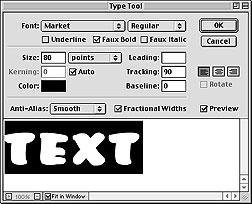
After creating a new file, I click in the image window with the type tool  and get the dialog box to the left. You can see I typed the word "TEXT" using the font "Market" at 80 points. and get the dialog box to the left. You can see I typed the word "TEXT" using the font "Market" at 80 points. |
|


|
2.
On the left above you can see how my text turned out when I picked the teal color for the word. I
wanted to make it larger so I chose Edit: Transform: Scale and enlarged it to fill most of my image window. You can see the larger version on the bottom. |
|
|
|
|
3.
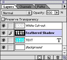
Next I Command-clicked (Windows=Control-click) on the text layer. That loads a selection of the
outline of the letters.
I'm going to make the layer that I named "White Cut-out" that you see to the left. I create a new layer and name it the choose Select: Inverse and fill the selection with white. Now anything I do below this layer will only show through in the letter shapes.
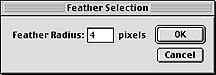
With that selection still loaded, I create another layer. I named this one "Feathered Shadow" I chose Select: Feather... and typed in a Feather Radius of 4 pixels. That's going to make the selection edges much softer. Now I fill that selection with black. |

|
4.
Well, after all that layering, filling and feathering, this is what my image looks like. It's
pretty cool as it is and you might want to stop here and use this text.
But who wants to stop now? |
|
5.
To make the drop shadow, I click on the move tool  and move the contents of the "Feathered Shadow" layer down and to the right a little. and move the contents of the "Feathered Shadow" layer down and to the right a little. |
 |
6.
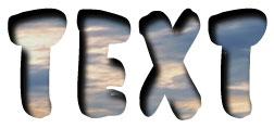
Instead of letting the blue-green text show through, I made this variation by putting an image
below the "Feathered Shadow" layer. Looks very cool, huh?
Having those two top layers containing the white area and the drop shadow lets you easily explore an infinite number of variations. You can create layers below them filled with different colors, patterns or images until you find exactly what you're looking for. |
 |
7.
Here's another example with a little variation. I made this logo for my pseudo company and then
merged both elements so I had everything on a single layer.
|
 |
8.
Next I duplicated that layer and changed the coloring of the elements to black. I moved it behind the
blue layer and nudged the black elements down and right.
|
 |
9.
For this variation, before filled with black, I made it look more like a shadow by feathering the
selection and then filling it.
Man, you can make cool stuff with Photoshop!
Happy Image Editing! |
|
|
Latest Forums Clone YourselfThat is quit nice. But I think that can be more easy to do.. |
|
|
