Tutorials
Using the Invert command
Oct 18th 2005
|
Using the Invert Command:
|
|
1.
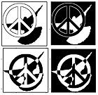
Back in 1993, I had
this group at my school that wanted me to make a logo for them. They were all about promoting
racial unity and tolerance, so I came up with the idea of pairing the peace symbol and a dove.
To the left you see a few variants I was working with. (I've managed to save them all these
years. From 3.5 inch floppies, through Syquest and Zip, to CD-R, I hung on to them.) I think
they are some good simple designs, and much of their strength lies in the contrast between black
and white.
Contrast is what the Invert Command is all about. It reverses the colors of anything you apply it to. I remember struggling with how to do that on these designs. Back then I hadn't met Photoshop yet, (I was using some simple paint and illustration program) and to do the effects you see was time consuming. So it was a fateful day when I found Photoshop's Invert Command. These days, a job like this would only take a few seconds. Let's learn how to use it. |
 |
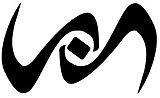
2.
Like many of my tutorials, this isn't a "now do this, now do that" project. It's an exploration of some of the possibilities of one of Photoshop's commands. Hopefully, you'll look through this stuff and come up with your own ideas. The other day I was in the doctor's office waiting room (oh, thanks for your concern) and I picked up Seventeen magazine (there was something in there about Tom Green, but hey, I don't have to explain myself to you, do I?). Anyway, when I look at magazines (ones with cool designs like Vogue, Wired, whatever) I always check out how the ads are designed, how the page layout is composed, any use of retouching, etc.. So I was looking through the ads in Seventeen and getting all these ideas for projects or designs of my own. Not rip-offs mind you. Just stepping off points- when I see designs I always try to think of alternatives - other ways it could be done. Try to do that yourself.
I made this design to the left using Photoshop's pen tool  . Then I converted it to a selection and filled with Black. Looks cool. I'll have to use it someday. But I wonder what it looks like as White on Black? I don't have to wonder long, because I simply choose Image: Adjust: Invert and I've got my answer in a split second. I like it better this way, don't you? . Then I converted it to a selection and filled with Black. Looks cool. I'll have to use it someday. But I wonder what it looks like as White on Black? I don't have to wonder long, because I simply choose Image: Adjust: Invert and I've got my answer in a split second. I like it better this way, don't you?
It's possible you haven't used this command it's kind of hidden away there and it doesn't make much noise. But it's got a lot of power. Here's a keyboard shortcut worth remembering: Command-I (or Control-I for you Windows cats.) |
|
|
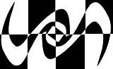 |
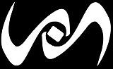
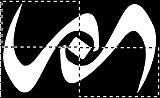
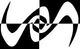
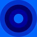
3.
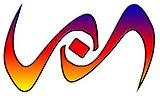
Contrast is a visual comparison between elements in a design. Maximum contrast in Value is Black next to White. Contrast attracts attention and interest in a design. I'm going to make some selections with the Rectangular Marquee Tool  and jack up the interplay between values in my design. and jack up the interplay between values in my design.
First I drew two selections. You guys know that if you hold down the Shift Key after the first selection, the second is added to the first. Then I selected Image: Adjust: Invert and look at the results. The image is divided into quadrants- each one the opposite of its neighbor. I know my original shapes looked great, but this seems to be getting better and better.
At the bottom is a variation, dividing the design into eight sections. |
 |
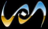
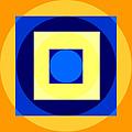
4.
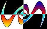
What about color? I
used the Gradient Tool
 to fill my shapes with a Chrome Gradient. (I also contracted and stroked the selection with black.) to fill my shapes with a Chrome Gradient. (I also contracted and stroked the selection with black.)
Trying out one of my favorites, the quadrant division, you can see how the hues have been reversed as well as the values. |
 |
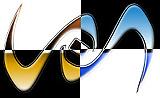
5.
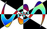
Maximum contrast in Color is placing a hue next to it's compliment. Complimentary Colors are visual opposites. In RGB, Red & Cyan are compliments, so are Green & Magenta, and Blue & Yellow.
When you apply Image: Adjust: Invert to a colored area, you get a negative effect, or the complimentary colors of the hues that were there previously.
I filled the original shapes with another gradient, (Blue, Red, Yellow) and made a couple more variant designs using the Invert Command.
Enough with this image! Hopefully, you get the point. There's always a lot of alternate solutions to a problem, especially if you're using Photoshop. |

|
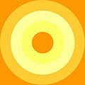
6.
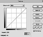
We'll stick to the
Invert Command because it's the easiest, but , FYI, there's other ways to do this.
Image: Adjust: Curves will bring up the dialog box you see to the left. See the diagonal line running from lower left to upper right? This is placed in front of a 4 x 4 square grid. What you see represents the image "curve" as it exists. Changes in position of the lower left will affect the dark values in your image and if you move the point in the upper right, the lightest values in your image will be affected. If you completely reverse the angle of the curve (like the second image), you've just done what Invert does- completely reverse the hues and values of your image.
If I take my monochromatic blue circle design, and change its "curves" and I described, I get the yellow & orange version you see below it. |
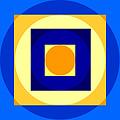 |
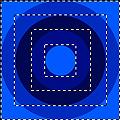
7.
To the left here, I've taken to using the Rectangular Marquee again. I thought it would be interesting to see a contrast in shape as well as color, so I drew a few square selections.
(I'm sure you guys know that if you hold down the Option Key (Windows= ALT) after making a selection, the current selection is subtracted from the previous.) You see the result in the center at left.
To produce the alternate version at the bottom, I selected All and chose Image: Adjust: Invert again.
So what have we learned? The Op Art painters of the 1960's would have loved this Invert Command. |
 |
8.
When you invert an image, the brightness value of each pixel is converted to the inverse value on
the 256-step color-values scale. For example, a pixel in an image with a value of 255 (White) is
changed to 0 (Black), and a pixel with a value of 5 gets to be 250. If you're the type of person
that can scan film negatives with your scanner, you could take a grayscale negative, scan it and
then choose Invert.
Here I took the Grayscale image you see at top left, and with a couple of minutes work (selections, inversions, type, & filters) changed it to what we've got below it.
This guy looks mad! |
 |
9.
In this image, I created a Layer Mask and masked off roughly half of it with a linear gradient from left to right. See my Layers palette:
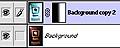
This effectively covers about half the space, so when I apply Image: Adjust: Invert, we get what you see here. Notice: when complimentary colors mix, a neutral hue is produced. That's why you see a grayish strip down the middle. |
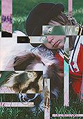 |
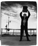
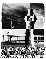
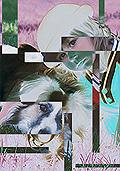
10.

Before I set you all free on an inverting rampage, take a look at a couple of others. I used the "boy and his dog" image and drew a few rectangular selections. I inverted the contents of those selections. See the two opposite outcomes over there on the left.
So, we have one command and tons of possibilities. Hopefully now you'll more readily consider the Invert Command to visually jazz up your images.
Now go crazy editing images! |
|
|
Latest Forums Clone YourselfThat is quit nice. But I think that can be more easy to do.. |
