 |
1.
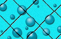
This is not quite a tutorial. It's sort of an addition to another step by step guide I made called Water Droplet Effect in which I created the "water drops" on the image to the left. This one relies pretty heavily on the assumption you've read that other one, and contains some additional points to consider when applying the water drop technique to photographic images. |
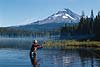
I'm going to use similar steps to put some water-drop shapes on this image of Mr. Field & Stream. Let's review the steps:
 -One- -One-
Use the elliptical marquee to select the area where you want the "bubble" to be. Copy and paste onto a new layer.
 -Two- -Two-
Apply the Spherize Filter until you have the 3-D distortion you want. |
2.
 -Three- -Three-
On a new layer create a Radial gradation of value...
 -Four- -Four-
... and change that layer's blend mode to Overlay.
 -Five- -Five-
Us the Layer Style, Inner Glow with black picked as the "glow" color to darken the "drop" near its outer edge.
 -Six- -Six-
On a new layer, under the rest, fill the circle with black and blur it. This is our shadow. Move it down and to the right (or comply with your light source.)
|
|
|
|


|
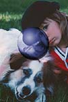
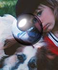
3.
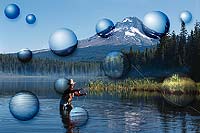
The 3-D effect that you get with images is very cool as you can see. It reminds me of a mirrored sphere I saw years ago created in a 3-D program called Bryce. Here's some things to consider when using images:
First, placement of the circular selection is important. I've tried the Spherize Filter on several parts of a photo. In some places, the effect looks just right and in others it seems weird and unnatural. The filter expands pixels near the center of the selection and pinches those near the outside. So you'll get used to how important it is try out different spots in your image and evaluate the results.
Having a reference within the bubbled area is important. In the example to the left, I've included a vertical element (the tree) within my selection. It's important that the tree top is off center. Too close to the middle and it would bloat up; too close to the edge and it would be squashed too much. Including the tree is important. Because we can see the tree is bent, we feel more like we're seeing through something transparent; but shaped differently than the "flat" surface of the photographic image. A "droplet" in a location such as this is more interesting to see than an area of flat and even color, such as the blue sky. |


|
4.
As I mentioned in the other tutorial, one thing to consider is the lightness of the background image. For bright areas, like we saw above, you want the radial gradient to be pretty dark with just a small white highlight. But you must click and drag the gradient tool a greater distance to produce an overall lighter gradient if the image isn't very bright.
Compare the gradient used for the images to the left to that which you saw in the above examples, or in the last tutorial. |


|
5.
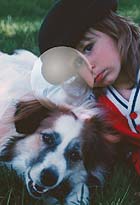
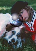
Having the "bubbles" you create on their own layers makes it easy to make individual adjustments. The techniques we've discussed previously produce pretty dark, difficult to see results on areas of an image which are very dark (see left). In this example after I was finished I made a brightness adjustment with the Curves command, until I felt that the "water drop" stood out enough. This sort of adjustment on a brighter area makes the "drop" look more like a soap bubble or as if it's filled with smoke; but here just saves this area from being relatively unnoticeable. |
 |
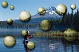
6.
Here you can see what effect several of our "water droplets" has on one photographic image. Maybe you can relate to some of the perception ambiguities I hinted at in the last tutorial. Some times when I see this- yea, it looks like drops of water lying on the surface of a photo. But other times they seem to be more like bubbles floating in the air- a part of the environment pictured in the image. If you wanted to enhance this interpretation, I would make sure some overlapping occurred. Seeing a bubble partially covered by the fisherman; or being overlapped by a tree would establish a believable depth in space. |
|
7.
Don't forget to experiment beyond what we've
talked about here in the tutorials.
Here, once the bubbles were created, I turned off (hid) the background layer, selected All, and chose Copy Merged from the Edit menu. Then I pasted all the bubbles together on the uppermost layer. Once they're all on one layer you can try filter, brightness/ contrast adjustments, layer styles, etc..
These two examples show two Hue/ Saturation adjustments. Now the viewer's perception of our shapes is definitely open to interpretation. |
|
8.
I used this image for the next few examples:

Another thing to experiment with is the layer's Blending Mode. Try out different modes and evaluate the results. For the gradient layer, I had said to use Overlay, which mixed the gradients colors with the underlying image. Here, I instead chose Screen, which always results in a lighter blend (except for black in your blend image (also note the layer's Opacity). You can see the result. It might be a smoke filled bubble. If I centered the gradient more, and colorized the bubble it might look like a glass sphere, lit from within by some colored light of mysterious origin. (Skip the surface drop shadow if you want your shape to have a sphere-like quality) |
 |
9.
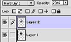
Here I selected the Hard Light Blend Mode, and made an adjustment to the layer's Curves which look like this:

(I also raised the level of Blue slightly, using the Blue Curve Channel.) The result is a sharp, harsh contrast bubble. |
 |
10.
Here's yet another variation. The adjustments I made above made our bubble look extremely clear and transparent.
I used the Image: Adjust: Color Balance command to push up the level of blue. |
 |
11.
Don't forget you may also paint onto the bubble shapes if you want to enhance their reflective quality. If you actually observe real bubbles or drops of water, one of their qualities are some amazingly complex and highly reflective areas. I haven't found an easy way to do that yet.
In the example here, I painted a simple patch of white on our sphere shape, using a custom brush I made by distorting the roundness of a circular brush. |
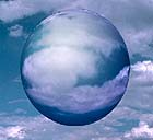 |
12.
I just wanted to show you one final example, and one last thing to consider: the size of your "droplets." In this image a large sky is featured. I made one large shape according to the techniques we've been over (minus the drop shadow), and the sphere had such an effect, I didn't want to proceed any further. |
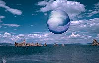 |
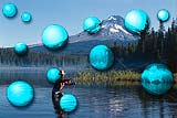
13.
Here's the whole image. Once I'd made that one large shape, I could get past the perception that this looked like some strange, highly reflective sphere floating in the air above the water. Is it an alien craft? The entrance to another dimension? Whatever it is, it's definitely surreal. All It needs is the reflection on the water. But that's another story...
Happy Image Editing! |
