|
1.
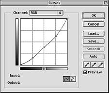
The Image: Adjust: Curves... command is sort of a one-stop place to do things like adjust the brightness & contrast, and color levels of an image or a selected portion of an image.
Much of what you do in the Curves Dialog Box you can do with other commands such as Image: Adjust: Brightness/Contrast.... One of the great things about Photoshop is that there are many ways to approach a problem. Each person you ask might have a slightly different solution. But it can also be intimidating and a bit confusing when you're beginning. Only lots of experience will help you decide on the simplest course of action. As with everything else in life, the more practice you have, the better you'll become.
Here I'll try to show you how the Curves Dialog Box gives you more control over adjusting specific values and colors in an image. By knowing where to click on the curve, you'll be able to control exactly what portions of your image are affected.
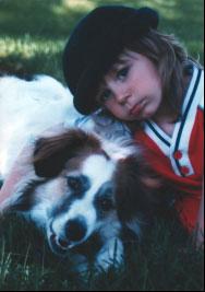
I use the curves dialog box in the second step of my tutorial,
Retouching & Color Correcting 2: Adjusting Curves
where I use the command to adjust the darker values of the image of the boy and dog to the left.
|

 |
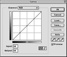
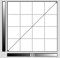
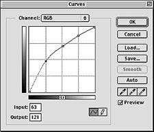
2.
When the Curves Dialog Box first pops up, you'll see a straight diagonal line running from lower left to upper right. This is placed in front of a 4 x 4 square grid. What you see represents the image "curve" of the tonal range of your current image. You can click on the diagonal line and drag it to alter the brightness and contrast of your image. The Curves button  is pressed down by default, and that's what I'll be using to do all my work. When you get good- really good, you might want to use the pencil pointer is pressed down by default, and that's what I'll be using to do all my work. When you get good- really good, you might want to use the pencil pointer to draw your own curve. First you'll have to know what you want the curve to look like to use this feature, the Arbitrary Map Option. After you draw a freehand curve you hit the Smooth button to make it look nicer. to draw your own curve. First you'll have to know what you want the curve to look like to use this feature, the Arbitrary Map Option. After you draw a freehand curve you hit the Smooth button to make it look nicer.
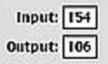
Once you start making adjustment to the curve, the Input and Output area displays variables representing the original (input) and adjusted (output) position of the point you move on the curve.
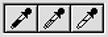
The eyedropper tools behave much the same as they do in the Image: Adjust: Levels... command, establishing the black, white and mid-tone points in your image. For more info on adjusting levels see my tutorial,
Retouching & Color Correcting1: Adjusting Levels. |
|
|
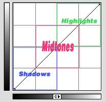 |
3.
Let's look at the graph for the curve where you'll be doing most of you work. Along the left side and bottom, you'll see the value scales which represent how points on the graph are distributed. Those areas near the upper right affect light values. If you click on the diagonal line and move it there, you'll be affecting the highlights of your image most (for example, clicking the top right point and dragging it straight down along the right edge would darken all your highlights). Any movement of the curve in the center of the graph will affect Midtones most immediately. The lower left area is concerned with dark values, so any movement of the line in this area changes the way your image's shadows appear (for example, clicking the bottom left point and dragging it straight up along the left edge would lighten all your shadows).
Tip: You can click the grid while holding down the Option key (Mac) or the Alt key (Windows) make the grid change from 16 squares to a whopping 100! This can be helpful after you start anchoring multiple points of the curve. Key-Click again and the graph returns to its original size. |
|
4.
Any changes to the center of the curve will
affect the middle values most. Here (in the
images to the left) I dragged the center of the
line down and to the right slightly. This served
to darken my image considerably.
|
|
5.
Here I clicked on the center of the line and
dragged up and to the left. Now the values in my
image are noticeably lighter and there's a little
more contrast. |

  |
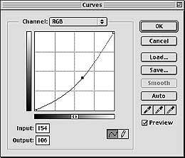
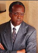
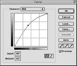
6.
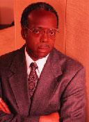
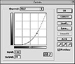
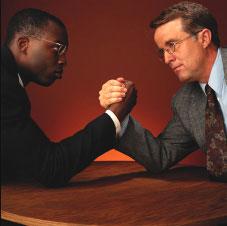
If you click on the Channel: pop-up menu, and you have a multi-channel image open (such as RGB (3 channels) or CMYK (4 channels); a grayscale image only has 1 channel (black)), you can make adjustments to individual channels. Here I selected Red and made a curve with angles up and to the left slightly. As you can see, my image is suddenly a lot more "red". Boy, does this guy look mad!
Conversely, if you drag the curve down and to the right, the level of red is decreased and it's complementary hue, cyan saturates the images. Those of you who use the Image: Adjust: Color Balance... controls regularly will be familiar with this concept. |
|
7.
So far we've just been making broad changes to the
entire curve. What makes the curves dialog box the
place to go for certain jobs is its ability to "anchor" points of your curve, and make changes to selective areas. Though you can anchor up to fifteen separate points on the curve graph, for simplicity sake I'm going to deal with only 3 tonal ranges here: Highlights, Mid-tones, and Shadows.
In the image to the upper left, I began by anchoring three points. All you have to do is click on the existing line. I clicked at the bottom corner of the top-right square. Next I clicked on the exact middle of the line and grid (this anchors the middle range of values). Finally I clicked on the top corner of the bottom-left square. Now if I drag the curve up from that point, only the darkest values are changed because the two other positions anchored- they won't move. |
 |
8.
Low Contrast Image
If you want to get to know the Image: Adjust: Curves... command, pick an image or two and play along with me at home on these few examples.
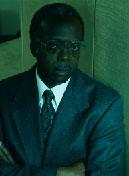
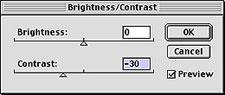
Here I'm going to play the part of the evil retoucher and purposely harm some very nice images. For instance, in this example I chose Image: Adjust: Brightness/Contrast... and lowered the contrast resulting in a flatter looking image with less intense colors. My reasoning is this: if I save a copy of the original photo, I can use the Curves Command to adjust my lower contrast version side by side with the original. If you do this, you can develop your skills at correcting common problems by using Curves. |
|
 |
9.
Low Contrast Image
Since I can look at the original image, I can see what my adjustment should look like when I'm done. For the sake of simplicity, in each of the examples below I'm going to start out by anchoring my curve in the same three spots as I did in step 7 above. Then I'll adjust those until the picture looks as close to the original as possible.
Remember, Photoshop will allow you to anchor up to fifteen points on the curve, if you want.
To the left below you can see the curve required to fix my particular contrast problem. The curve is logical: it does just what cranking the contrast up in Image: Adjust: Brightness/Contrast... would do. The light values are lightened, and the dark values are darkened. |
 |
10.
Low Contrast Image
After my curve adjustment, the image looks pretty close to the original before I turned down the contrast. |
 |
11.
Dark Image
I have turned down the brightness in the image you see to the immediate left. Solving this problem is just a matter of moving my three points on the curve straight up. The amount you move each point will depend on the image of course, - it's something to play around with. Having the reference of the original image comes in handy here.
Remember the point in the lower left represents dark values, the middle point is mid-tones, and the upper-right point affects lighter values. You can see I lightened the dark values most, and the light values least by comparing the distance their points traveled vertically. The adjusted image is to the left below. |
 |
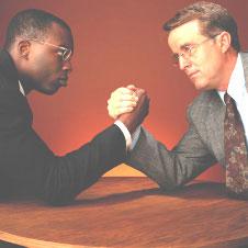
12.
Light Image
I took this image of two boring guys arm wrestling and gave it way too much lightness. By now perhaps you can predict what I need to do. I'm going to have to move my three points down vertically on the curve graph. It's sort of the opposite of what I did above in the dark image and of course it makes sense that it should be. You can see my curve to the left, but I hope I've communicated the fact that there's no precise formula to follow. The exact appearance of your curve will depend on the content of your image. In my curve, all three points traveled about the same distance down to give me the corrected image below. |
 |
13.
Adjusting Selections
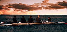
In this tutorial, we applied curve adjustments to the entire image. But a great use of the Image: Adjust: Curves... command is to apply it to a selected area only. Here I'm going to make adjustments to the sky in the image to the left. In this, the untouched image, the sky has a lot of red and yellow in it. Let's see if we can change that. |
 |
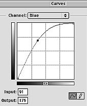
14.
Adjusting Selections
After I draw a quick selection around the sky using the Polygonal Lasso Tool , I choose the Blue Channel and cranked that baby up. Though we've sacrificed realism perhaps a bit, isn't the sky much more pleasant to look at? , I choose the Blue Channel and cranked that baby up. Though we've sacrificed realism perhaps a bit, isn't the sky much more pleasant to look at? |
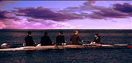 |
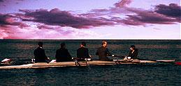
15.
Adjusting Selections
Just for fun, on top of what I did above I make adjustments to the Red Channel and the composite RGB channel (left). You can see the results. Now things are definitely looked stylized or surreal. |
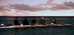 |
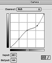
16.
Adjusting Selections
But can I convincingly change the colors in the sky? You bet. At the above left you see the original image again followed by my new version. What if you want to use this image but hate the ugly sky hues? I made a few subtle change in ALL of the color channels, increasing the levels of blue and cyan most, and lightening the darks and midtones in the composite channel. Give it a try yourself on one of your images.
Happy Image Editing! |
