Reviews, updates and in depth guides to your favourite mobile games - AppGamer.com
|
Tutorials
Creating a letter seal image
Oct 18th 2005
|
Creating a Letter Seal Image:
|
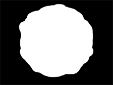 |
1.
You see a lot of tutorials to make a aged/burned paper effect, but these letters usually had a royal seal to go with. Create a 640 x 480 image and give it any background color you want. Create a new channel and call it "Outline". Now select the Elliptical Marquee Tool and drag a selection while holding the Shift-key. Fill this selection with white.
Then run around the circle with the Lasso Tool. Invert selection and press Delete.
Experiment a little until you get something like the picture. |
|
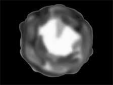
2.
Now
duplicate the channel you just made and call it "Bump". We are going to paint the bump map for the letterseal. Ctrl-click the channel and take the Airbrush Tool. Start painting shades of gray and black all over the seal. Leave the middle white, and the make the sides darker. How darker you make it how deeper the relief will be. This part is very experimental and you may have to come back later and try it again. |
|
|
|
|
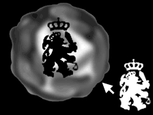
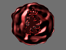
3.
Most
letterseals have a logo or a weapon on them. So find yourself a
nice logo/weapon or use a letter. I'm using a picture of the Lion
of Flanders. Put the logo in a new channel, and load the selection.
Go to the bump map, position it in the center of the seal and fill
with black. |
|
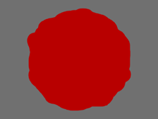
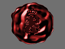
4.
Load the selection of the Outline channel, and create a new layer.
Fill the selection with a reddish color
(I chose R:184 G:0 B:0 ).
Keep the selection and go to
Filter>Render>Lightning Effects.
Use the following settings:
Light type: Directional
Intensity: 44
Gloss: -11
Material: -100
Exposure: 0
Ambience: -11
Texture channel: Bump
Height: 100
Position the Light source like in the image. Now in this step things can go wrong, basically when it doesn't really look like a letterseal. Then you'll have to go back to Step 2 and adjust your bump map. Also these setting are pretty experimental, you can probably get a better look if you mess around a bit. |
|
5.
If you followed along nicely, you should have something that resembles the picture. As you can see there are some minor flaws in the picture. The logo is a little rough and it has a grey border on some places. This is because the logo wasn't really top notch quality. If you used your own logo you can skip this part if you want.
Go to Image>Adjust>Hue/Saturation. Leave Hue at 0 and crank the Saturation up to 68. Don't forget to check colorize. To get rid of the roughness go to Filter>Blur>Gaussian Blur and apply it at 0,5.
|
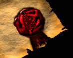 |
6.
Your
probably not going to use it at this size, so resize it to the size
you want. Adding a piece of cloth, like I did on the left will make
it even more interesting. |
|
|
Latest Forums Clone YourselfThat is quit nice. But I think that can be more easy to do.. |
|
|
