Reviews, updates and in depth guides to your favourite mobile games - AppGamer.com
|
Tutorials
Create a Sky Image
Oct 18th 2005
|
Painting a realistic landscape Part 1 : The sky:
|
 |
1.
This tutorial was written by Mihai
www.roundpixel.org
Well - a bit of blah blah - this tutorial assumes you have some drawing skills (I'm talking pencils) and a fair knowledge of Photoshop.
Since the whole picture would make for a very long and tedious tutorial I will split it into 3 parts- sky, water and land. Some of the parts have to be drawn as a whole though so I am including those here even if it's not just sky...
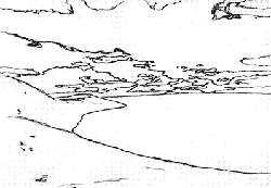
Now to begin you will need some inspiration - look out the window, switch the TV to National Geographics or get that postcard mom sent you from the islands:)
My inspiration comes from from the beaches in my birth town. |
|
|
2.
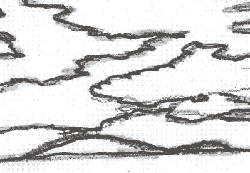
Tools you will need:
- pencil, paper and eraser (if you want you can do the sketch in Photoshop too but I prefer the old school approach).
-graphic tablet (if you're really really good you can do it with a mouse. I'm not that good - I have a Wacom Grapphire2).
- scanner (not needed if you do it all on the computer).
- thin black felt tip marker
As you see I sketched the outlines of my landscape and then I scanned it. |
|
|
|
|
3.
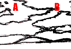
You'll see that over the pencil lines I drew with a thin black felt tip marker. It is essential to have a thin, visible line because you will have to have very sharp edges for your clouds... |
|
4.
I then cleaned the image a bit - go to Levels (Ctrl+L) and tick the
set white point box. Then click with the cursor an area on the canvas
that is light grey (or anything that you believe does not belong in
the drawing) to remove the scan garbage. The result was a bit light
in color so I hit Auto Contrast (Shift+Ctrl+Alt+L) |
 |
5.
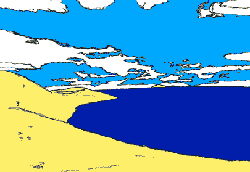
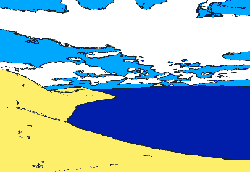
My picture looks much sharper now "A" but I want it even sharper. So I pushed the Contrast (Image/Adjustments/Brightness/Contrast) all the way to +100. Then I went to Hue/Saturation (Ctrl+U) and gave it Saturation -100 because the contrast setting gave me some blue-ish tones...That gave me "B". |
 |
6.
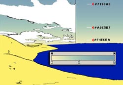
Ok - now let's add color. I filled the clouds with white, the sky with light blue, the land with yellow and the sea with a darker blue, each on its own layer. The colors I used are #FEEF6A, #00A8FF, #001CAB and white. |
 |
7.
Then I changed my mind - It looks too much like a postcard for a tropical voyage. So I inverted the colors on the sky and clouds... - I decided to make more clouds - perhaps stormy...I like clouds... |
 |
8.
Time to add a little realism to the sky - I chose a 3-color gradient and replaced the sky layer with that. |
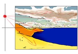 |
9.
Now comes a very important step that will affect all elements in my picture - not just the sky. I have to decide from where the light comes. That way I can shade my clouds, landscape and I will now how the light falls on the waves later on. I decided that it is sometime around 3 PM. The light will come from the left, above the horizontal middle of the picture. I roughly shaded the land and I added shadows to the clouds. Nothing fancy yet - just some rough strokes with progressively darker shades of brown as I neared the "middle" of the clouds. I also changed the overall color of the clouds to a dirty rose. |
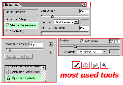 |
10.
.BRUSHES.
I need to tell you about brush settings - they are very important. I am using mostly the same brush shape but with different sizes - according to the job at hand. All tools use the same brush shape - the Spatter brush. The scatter settings differ. Sometimes you need the stroke more scattered - other times - a straight line...Use your imagination. |
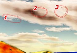 |
11.
Burn/Smudge/Paint
Once I obtained the base color and shade I then proceeded to make my clouds a bit more realistic. I removed the black outlines and I used the brushes I mentioned above to paint some dark strokes on my clouds - the brush was not scattered for now (Area 2) The Dodge brush was used for lighter areas - the same - not scattered. (Area 3) Then I smudged a bit the whole thing. The smudge tool had a strength of 40% - normal blending. Then I took the paintbrush, used the scatter settings from point 10 (218%, both axes - Pen Pressure - 14 spatter brush) and drew some outlines for my clouds (Area 1). . |
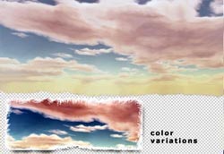 |
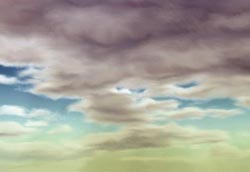
12.
A lot of smudging later (and a few days later....) I ended up with
this - It may be considered finished - Of course there are many
improvements I could add but it was very long and I got tired...
I am not very good at tutorials - this is my very first actually
so please forgive the inevitable lacks - I would be more than pleased
to clarify anything...just drop me a line. I also added a larger
version of my "finished" sky with slightly modified colors on my site - you can see it here. I hope you found it useful at least a bit...I will try to make the land and the water tuts better.... stay tuned:) |
|
|
Latest Forums Clone YourselfThat is quit nice. But I think that can be more easy to do.. |
|
|
